The Psychology of Color in Hospitality Design: Hotels, Restaurants & More
“Color is a power which directly influences the soul.” ~Wassily Kandinsky
Color profoundly impacts human emotions and behavior — especially in hospitality design. Choosing the right palette for a hotel, restaurant, or resort can make or break the guest experience. In contrast, the wrong colors can create discomfort or fail to evoke the desired mood.
In hotel color design, every shade contributes to how guests perceive your brand — from the hotel lobby colors that set first impressions to the restaurant color schemes that influence appetite and comfort.
At Sara Hospitality, we help hoteliers and designers understand the psychology of color in hotels, ensuring every space feels inviting, balanced, and brand-aligned.
Understanding Warm and Cool Colors in Hotel Design
Colors can be broadly divided into two emotional categories — warm and cool — each evoking different responses from guests.
🌞 Warm Colors
Warm colors — red, yellow, and orange — are energizing and stimulating. They create vibrant, social environments perfect for restaurant interiors and hotel lobbies where guests gather.
❄️ Cool Colors
Cool colors — blue, green, and purple — promote calm, relaxation, and tranquility. These are ideal for hotel bedrooms, spas, and wellness areas, where guests come to unwind and rejuvenate.
⚪ Neutral Colors
White, black, gray, and beige create balance. Many modern hotel color designs incorporate neutral tones to make spaces feel timeless, clean, and spacious. That’s why white walls and soft beiges are common in boutique hotel interiors — they provide visual rest for the mind.
Related read: Discover how lighting complements color schemes in hotel lobby lighting ideas
The Color Wheel: A Designer’s Toolkit
When choosing a wall, flooring, or outdoor color, the tip is to understand the use cases of the space/decor in your mind. What exactly is the purpose of the area, and how do you want people to react to that?
If you are using warm colors, it becomes a high-energy space that radiates power, happiness, optimism, and energy.
If you're using cold colors, it can be considered an excellent place to relax, and wind down and it develops calmness as well as sadness.
While white and black are considered neutral colors, that's the primary reason that you experience White Walls in some hotel bedrooms, which let the occupant feel neutral about the place.
Color swatches in outdoor shops, restaurants, cafes, and hotels are chosen very carefully. It might feel that choosing colors is an easy task, but it takes a whole thought procedure that defines the elements and ambiance of the room forever.
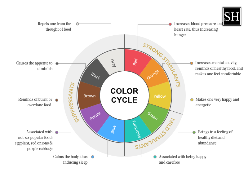
The Color Wheel
Interior designers are equipped with knowledge about colors and an understanding of color blending and combinations. Most importantly, understanding the mood, habits, and psychology of the guest can obtain the desired design and color for the space. Before we dig into the details, it's essential to understand the color wheel and the three primary colors:
Yellow, red, and Blue
With the combination of the following:
- Yellow + Blue = Green
- Yellow + Red = Orange
- Blue + Red = Purple
Blending primary colors with secondary colors, we obtain tertiary colors. As you can see in the color wheel, the colors are complementary to each other. Each pair of color wheels complements the other to create a neutral color. The color associated with the blue and green sides is warm colors while colors in the yellow and orange sides are cool colors.
Colors have certain energy related to them. It can have various impacts on your visitors, and also decide would they be revisiting your space again or not.
Colors have the power to energize, cheer, concentrate, relax, and even make us remember great memories. Some colors have a negative impact and can make us feel irritated, fatigued, and tired. That's why choosing random colors is a strict NO, as you will never know what kind of vibration is your space giving to the visitors.
Practical Tips for Choosing Hotel Color Palettes
Here are three expert-backed tips to help you select the perfect hotel color design for your property:
-
Use Visualization Tools:
Capture photos of your space and test color combinations with digital tools like Adobe Illustrator or Canva. Build mood boards and experiment with different color hotel styles before implementation. -
Consider Natural Light:
Observe how sunlight enters your space during the day. Lighting dramatically changes color perception — a golden hue might look bright in daylight but dull under artificial light. -
Adapt to Room Size:
Bright colors make smaller rooms appear larger, while darker tones add depth to spacious areas. The goal is to balance tone and proportion to ensure visual comfort.
Remember: while most people respond similarly to color stimuli, individual emotions can vary. The key is to design for the majority experience, creating spaces that align with your brand’s energy.
Real-World Example: McDonald’s and Color Branding
Think of McDonald’s — what colors come to mind? Red and yellow, right?
Those hues aren’t random. They’re deliberately chosen to evoke energy, excitement, and appetite. Red accelerates metabolism, while yellow stimulates hunger and positivity.
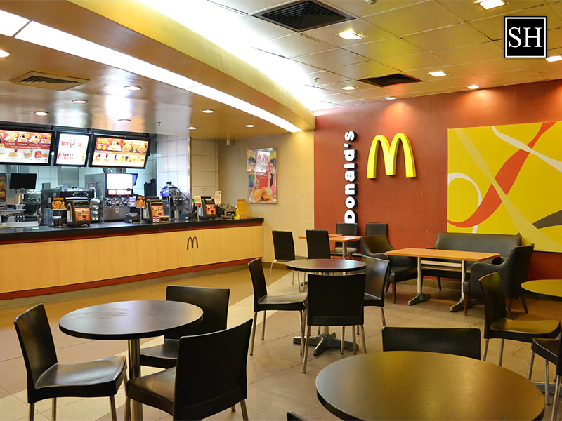
This combination works because it aligns perfectly with McDonald’s brand values — fast, friendly, and youthful. The same principle applies when selecting hotel colors: your palette should mirror the emotional promise your property offers.
Learn more: Explore how to refresh your brand aesthetic with a hotel renovation cost per room guide to budget your redesign strategically.
Why Color Matters in Hospitality
In hospitality interiors, color hotel style and design go far beyond aesthetics — they shape emotion, behavior, and brand loyalty. The right color palette can:
- Increase guest satisfaction and comfort
- Reinforce brand identity
- Encourage repeat visits
- Differentiate your hotel in competitive markets
At Sara Hospitality, we integrate color psychology into our hotel furniture design to ensure each piece complements your overall ambiance.
Conclusion
Color isn’t just decoration — it’s communication. Every hue in your hotel color palette speaks to your guests’ emotions, influencing how they feel, rest, and remember their stay.
At Sara Hospitality, we specialize in blending color psychology with functional furniture design to create spaces that evoke emotion and enhance experience. Whether you’re redesigning a boutique hotel, restaurant, or resort, our experts can help you craft the perfect color hotel style and design for your brand.
Ready to transform your interiors?
Contact Sara Hospitality today for a free color and furniture design consultation tailored to your property’s aesthetic and guest experience goals.
Call now : +1 678-431-9041 or write us at : sales@sarahospitalityusa.com
- SOFT SEATING
- BATHROOM VANITY
- FIXTURE EQUIPMENT
- Hospitality Casegoods
- Hospitality outdoor furniture
- Senior Living Furniture
- Hotel reception desk
- High end contract furniture
- Premium Hotel Bedroom Furniture
- Custom commercial furniture
- Hospitality Furniture Manufacturers in Canada
- Leading Hotel Furniture Manufacturers in Canada
- Casegood manufacture canada
- Cultured Marble
- SPC Flooring
- Boutique Hotel Furniture
CATEGORIES
-

What Is FF&E? FF&E Meaning & Hotel Furniture Installation Explained
-
What Is a Boutique Hotel? Meaning, Features & Design Explained
-

Custom Commercial Furniture vs Ready-Made Furniture For Hotels
-
Choosing the Best Hotel Room Chair for Comfort, Style & Durability
-

Senior-Friendly Furniture: Accessibility & Well-Being Features
RECENT POSTS

Author: Sara Hospitality
RELATED BLOGS
Ergonomic Chairs for Hotels: A Smart Investment for Comfort & Health
John Smith | Jun 10, 2026
How to Choose the Best Sectional Sofa for Your Hotel?
Sara Hospitality | May 20, 2026
Top 6 Ways to Impress Hotel Guests in 2026 & Increase Revenue
Sara Hospitality | May 08, 2026