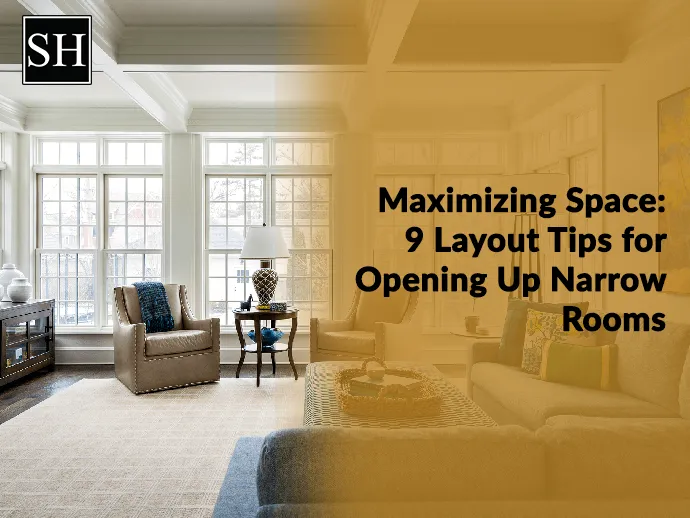
Maximizing Space: Layout Tips for Opening Up Narrow Rooms (Plus Mistakes to Avoid!)
Creating a small room structure is challenging, especially if the humble abode is small or narrow. If it is not maintained adequately, you may have an overcrowded space or an empty 'alleyway'. The restricted dimensions will limit the options, but the right custom hotel furniture helps in creating a functional space that seems more prominent than it looks.
Planning for the key to furniture structure in narrow living rooms, bedrooms, and other spaces. If you are working in a small area, it is crucial to be even more meticulous with pieces, stay or go. Here, we bring some expert tips that help you to design small rooms functionally.
Tips for Opening Up Narrow Rooms
Here are some fantastic tips for designing furniture in narrow spaces and winning the game against tricky square footage.
1. Place the Furniture Off the Floor
Placing the furniture on the floor is one of the best narrow design ideas as it will cover space in a better way. However, nothing makes a small room look smaller than heavy furniture plopped right on the floor, rather than using a table high up off the floor to make a small space more roomy. The hospitality furniture manufacturers create pieces with long, tapered legs, which are an ideal choice. The mid-century modern trend is famous in urban cities with small holes.
2. Create a Focal Point
In a small space, create a focal point by making a small accent wall. For creating a new look using artistic wallpaper, your favourite paint color or creative artwork structure. In this room, wallpaper and collective mirrors make a fantastic focal point. Also, you can decorate the wall with framed images or paintings. The artistic shelves and storage cabinets create a practical attraction point while offering extra storage space.
3. Form Straight Walkway
Creating a way for foot traffic in a narrow space is challenging. Thus, tweaking the arrangement will create a cosy environment rather than an uncomfortable path between your furniture. Therefore, it is better to arrange a seating vignette on one side of the long wall of the living room. For instance, creating a small seating space means you make a new path behind the chairs on the opposite long wall of the area. Its impact is a well-planned sitting area which is kept from foot traffic.
4. Choose Clear Furniture
When you can't build more space, it is always better to employ apartment design ideas than make it look like you have more space. So, one of the old but best tricks is to see play through furniture. Choose custom hotel furniture manufactured using glass or acrylic because it is the best way to trick the eye and make it think the area is more significant than it is. Thus, it is best to avoid heavy wooden furniture in favour of a glass or acrylic option. This makes the space more open and airy, making the room seem larger or sufficient.
5. Plan Your Pathway
Creating a pathway is a priority while planning the layout of your space. It is highly crucial for homes that have open floor space. The best way is to build a straight path on one side of the room. In this narrow space, you have two choices: You can place the walkway in front of the sofa or behind it. Locating the pathway behind the sofa covers a little more of the room. Thus, it clearly defines where you can walk, making living room seating more intimate. Placing the pathway in front of the sofa makes the living room structure feel bigger. However, creating a circular space in front of the TV may be disruptive. To decide the right solution, consider traffic coming through the room and the intention to use the room.
Common Room Structure - Mistakes to Avoid
The layout mistakes that interior designers cringe on and learn how to remedy them to create the best look.
1. Poor Space Allocation
Even in more prominent spaces, a few centimeters are wasted in one space, which can make a vital difference elsewhere. The corridors are a great example of this. Though it is attractive and necessary for functional reasons and fire safety, you must keep it to a minimum. The space you will save becomes highly useful in the living room and bedroom.
2. Not Allows The Light In
One of the most common mistakes discussed is placing curtains with window size. To open up the space and frame the window to look perfect, hang the curtains rods above the window. Also, you need to extend the hardware edges out past the boundaries. When the curtains are open, it bring a maximum quantity of light, and the window placement looks more significant than it will be.
3. Don't Forget to Store Enough Items
It is expected to make the costly mistake of forgetting how much storage you need and what type of storage you need. The kind of storage you require will vary depending on your lifestyle. Being involved in the planning of storage is essential. It is vital to have adequate storage. This will allow you to avoid clutter and create a calmer, more organized space.
Conclusion
Combining these tips and customizing them to fit your needs and preferences allows you to create a more open and functional layout for narrow rooms. If you want functional furniture pieces that easily fit into your space, contact Sara Hospitality. We are the leading hospitality furniture suppliers with the best furniture that helps you curate a functional place.
- SOFT SEATING
- BATHROOM VANITY
- FIXTURE EQUIPMENT
- Hospitality Casegoods
- Hospitality outdoor furniture
- Senior Living Furniture
- Hotel reception desk
- High end contract furniture
- Premium Hotel Bedroom Furniture
- Custom commercial furniture
- Hospitality Furniture Manufacturers in Canada
- Leading Hotel Furniture Manufacturers in Canada
- Casegood manufacture canada
- Hotel Casegoods
- Cultured Marble
- SPC Flooring
- Boutique Hotel Furniture
CATEGORIES
-

Hotel Franchise Renovation & Brand Conversion Guide (PIP Explained)
-

Beds for Hotels: Types, Sizes, and Buying Guide for Hoteliers
-

Professional Bathroom Renovation for Boutique and Franchise Hotels 2026
-

How to Choose Custom Commercial Furniture | Complete Guide
-

Boutique Hotel Furniture Layout: How to Plan Space, Avoid Costly Mistakes & Maximize Guest Experience
RECENT POSTS
RELATED BLOGS

How Much Does It Cost to Build a Boutique Hotel from Scratch?
Sara Hospitality | Apr 02, 2026

Top 8 Best Hospitality Furniture Manufacturers in USA 2026
Sara Hospitality | Mar 20, 2026

What Is the Hospitality Industry? Definition, Sectors & Importance (2026 Guide)
Sangeeta Agarwal | Mar 13, 2026


